Homepage Best Practices for Startup Entrepreneurs: Create an Impactful First Impression
Showcase your startup’s offerings and engage your target audience through proven web design best practices.
As a startup entrepreneur, your website’s homepage is your digital storefront. It’s the first point of contact with potential customers, investors, and partners. So, with your homepage, you need to make a great first impression and quickly. How do you do this? The key to attracting customers is implementing essential homepage best practices that a. effectively communicate your value proposition, and b. get visitors to take action.
Below, we’ll explore the essential components that should be on your homepage and provide a few examples to inspire your own design—check it out!
7 Homepage Best Practices for StartUps
1. Clearly State What You Do
Your homepage should concisely communicate what your startup does in a single sentence or phrase. Effectively communicating what your startup does on your homepage helps engage visitors and convert them into customers, investors, or partners—whatever your goal is! This can include your 30-second pitch or other messaging that articulates what you do in simple terms. Here are just a few of the many benefits of plainly stating what you do on your homepage:
1. Instant Clarity for Visitors, Investors, and Partners
A clear, concise statement of what you do helps visitors immediately understand what your startup offers. That way, they don’t have to scrounge your website to find information on what you actually do and lose interest. Quick, upfront clarity helps retain visitor attention and encourages exploration of your website.
2. Effective Communication of Value Proposition
Stating what your business does in simple language helps visitors quickly grasp the benefits of your product or service. This increases the chance of visitors engaging with your offering, because they understand your value proposition.
3. Reduced Cognitive Load
Have you ever read something so complicated that you immediately forgot it? That’s why clarity is so important when communicating your startup’s message. Using straightforward language makes it easier for visitors to process and retain information about your startup. This helps reduce “cognitive load,” the amount of information that your working memory can handle at one time. If a message is too complicated for your brain to grasp, it maxes out your cognitive load and slips away. Concise language helps visitors have a more enjoyable, memorable user experience on your site.
4. Broader Audience Appeal
Accessibility is crucial with your website’s language. Avoiding jargon and buzzwords ensures that your homepage’s messaging appeals to a wider audience. This includes those who are and are not familiar with your industry’s specific terminology. An inclusive approach to homepage messaging helps broaden your startup’s appeal and reach, attracting a more diverse range of potential customers, investors, and partners.
5. Increased Credibility and Trust
Trust is everything when it comes to converting leads to customers. Stating what your startup does in a transparent, honest manner helps build credibility and trust with your website visitors. Openness fosters a positive impression of your brand and can lead to stronger customer relationships and increased brand loyalty.
6. Enhanced Search Engine Optimization (SEO)
Using simple language to describe your startup’s offerings can also improve your website’s search engine optimization (SEO). By incorporating relevant keywords and phrases that accurately reflect your product or service into your content, you can increase your visibility in search engine results. Solid SEO tactics can attract more organic traffic to your website.
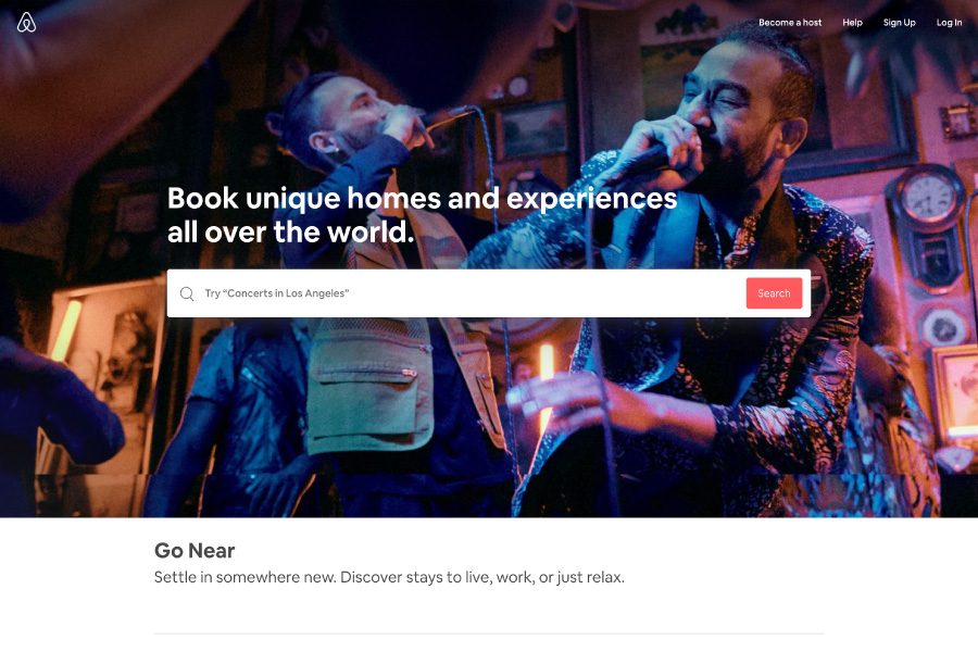
Example: Airbnb’s homepage (when they first started) displayed the tagline, “Book unique homes and experiences all over the world.”
2. Specify Your Target Audience
To effectively communicate your value proposition and attract the right customers, you must clearly define your target audience on your home page. Your target audiences are the people who are most likely to engage with your product and/or services. By identifying your target audience on your homepage, you can better attract and retain the right customers, leading to greater success for your startup. Here are several benefits of specifying your target audience on your homepage:
1. Relevant Messaging and Content
When you specify your target audience, you can tailor your homepage messaging and content to resonate with that specific group. This targeted approach ensures that your marketing efforts are focused on the needs, preferences, and pain points of the audience most likely to convert, resulting in a higher return on investment (ROI).
2. Improved User Engagement
Highlighting your target audience on your homepage lets customers quickly determine whether your product or service is suitable for them. By doing so, visitors who fit within your target audiences are more likely to explore your website further and take desired actions.
3. Reduced Bounce Rates
Specifying your target audience helps to filter out visitors who are unlikely to convert. This can reduce bounce rates and improve your website performance metrics.
4. Enhanced Customer Satisfaction
Defining your target audience helps set accurate expectations for potential customers. When visitors understand who your product or service is designed for, they are less likely to feel misled or disappointed. This transparency helps improve customer satisfaction, leading to more positive reviews, referrals, and repeat business.
5. Streamlined Marketing Efforts
By specifying your target audience, you can focus your marketing resources on attracting and retaining your most valuable customers. This targeted approach lets you optimize your marketing budget, ensuring that your efforts are directed towards the audience with the highest potential for conversion and long-term value.
6. Better Product Development
Identifying your target audience helps you gain a deeper understanding of their needs and preferences. Once you understand your audience, you can develop and refine your product or service offering to better serve your audience. This, ultimately, leads to increased customer satisfaction and loyalty.
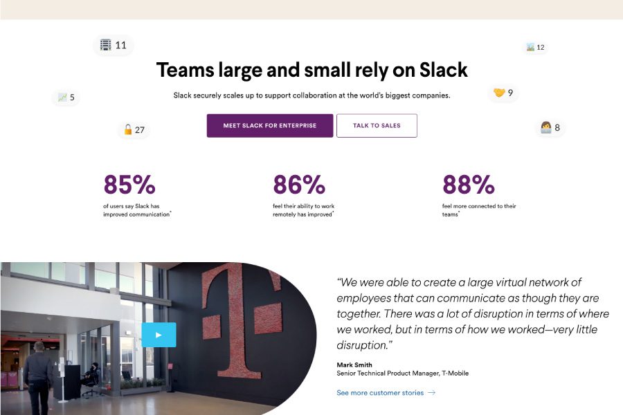
Example: B2B software company Slack indicates their target audience by stating, “Teams large and small rely on Slack”
3. Showcase Your Product, Software, Or Service
If you’ve got a product, service, or software, you need to display it on your homepage. Visually presenting your offering right away helps capture the interest of potential customers. Bonus, it illustrates the value of your offering in a tangible way. As the saying goes, you’ve got to see it to believe it!
Here are a few benefits of showcasing your product/service upfront on the homepage:
1. Immediate Engagement
High-quality images, videos, or interactive demos can grab the attention of visitors the second they land on your homepage. Engaging visuals encourage visitors to interact with your site, explore, and covert.
2. Emotional Connection
Emotionally connecting with a product is a key factor of customers deciding to convert. High-quality visuals can help promote an emotional connection with your offering! By showcasing your product in a visually appealing and relatable manner, you can create an emotional connection between the product and the customer.
3. Visualization of Benefits
Displaying the product or service you offer helps potential clients see the tangible benefits of it. Showcasing how your product works or illustrating real-life applications demonstrates its value and helps persuade visitors to engage with it.
4. Competitive Differentiation
Showcasing your product on your homepage can help set your startup apart from competitors in a crowded marketplace. By highlighting unique features, capabilities, or design elements, you can demonstrate your competitive advantage and attract more customers to your website.
5. Encourages Social Sharing
Visually compelling images, videos, or interactive demos are more likely to be shared on social media platforms, increasing your startup’s reach and visibility. By showcasing your product on your homepage, you create share-worthy content that can drive organic traffic to your website and grow your audience.
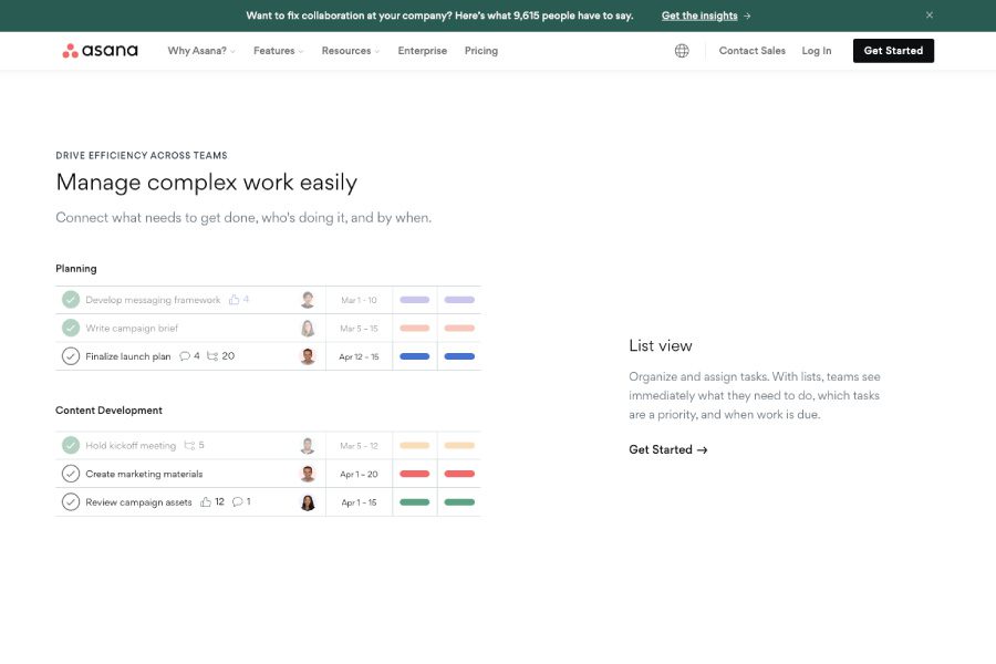
Example: Project management tool Asana includes an interactive demo on their homepage, allowing visitors to explore the platform’s features.
4. Transparent Pricing
Providing transparent pricing information on your website is essential. It not only helps build trust with potential customers, but it ensures a smooth purchasing process (which customers really enjoy!). Here are several reasons why transparent pricing is important for startup businesses:
1. Streamlines Decision-Making Process
Transparent pricing allows potential customers to quickly determine whether your product or service fits within their budget. By providing clear pricing information, you help streamline the decision-making process, making it easier for customers to choose your product or service.
2. Enhances Customer Satisfaction
Being upfront about pricing helps set accurate expectations for potential customers. When visitors understand the costs associated with your product or service, they are less likely to feel misled or disappointed after making a purchase. This transparency contributes to improved customer satisfaction and can lead to more positive reviews, referrals, and repeat business.
3. Simplifies Comparison Shopping
Many potential customers engage in comparison shopping to find the best value for their money. By providing transparent pricing on your website, you make it easy for these customers to compare your offering with competitors’ products or services, increasing the likelihood that they will choose your business.
4. Facilitates Budget Planning
Transparent pricing helps potential customers plan their budgets more effectively. When customers have a clear understanding of the costs associated with your product or service, they can allocate resources accordingly and make informed decisions about their purchases.=
5. Demonstrates Confidence in Your Offering
By being upfront about pricing, you demonstrate confidence in the value of your product or service. This openness can reassure potential customers that your offering is worth the investment, increasing their likelihood of making a purchase.
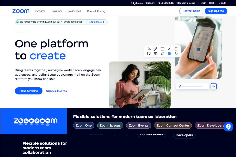
Example: Video conferencing platform Zoom displays its pricing plans on the homepage, allowing visitors to easily compare options.
5. Mobile Responsive
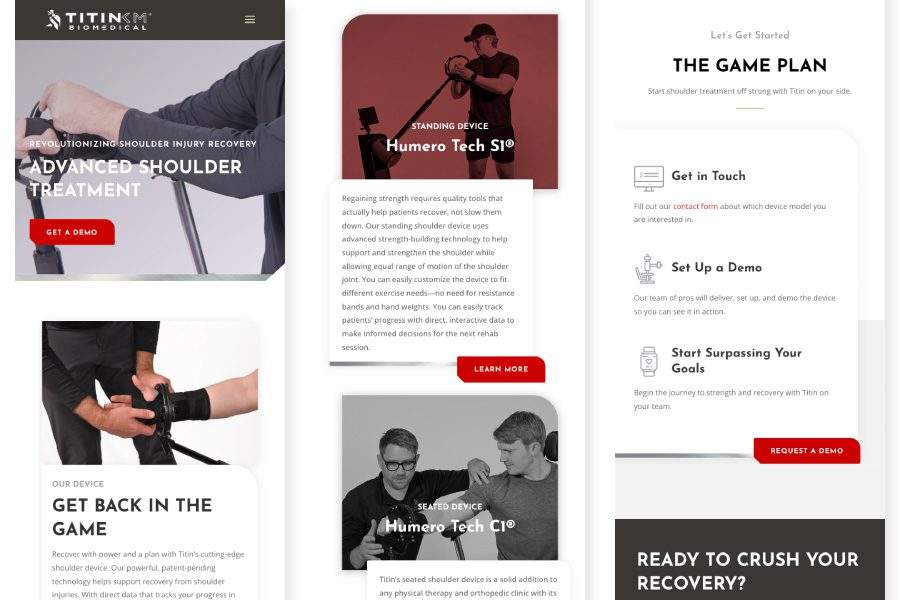
In today’s digital landscape, mobile responsiveness is no longer optional; it’s a necessity. With the majority of internet users accessing websites on their smartphones and tablets, your startup’s website needs to be mobile-responsive to be successful. Here are several benefits of making your website mobile-responsive:
1. Expanding Mobile User Base
With the rapid growth of smartphone usage, people largely rely on mobile devices for browsing, shopping, and accessing information. A mobile-responsive website ensures that your startup reaches and engages this expanding audience effectively, maximizing your potential customer base.
2. Improved User Experience (UX)
A mobile-responsive website adapts to various screen sizes and devices, providing an optimal viewing and interaction experience for users. This adaptability ensures that your website is easily navigable and visually appealing, regardless of whether it’s accessed on a smartphone, tablet, or desktop computer. These factors lead to a better overall user experience.
3. Increased Conversion Rates
A mobile-responsive design makes it easier for users to interact with your website and take the desired action, such as signing up for a newsletter, purchasing a product, or scheduling a demo. By providing a seamless browsing experience across all devices, you increase the likelihood of conversions and boost your startup’s success.
4. Enhanced SEO Performance
Search engines like Google prioritize mobile-responsive websites in search results, particularly on mobile devices. By ensuring your website is mobile-responsive, you increase the likelihood of ranking higher in search results, attracting more organic traffic, and improving your overall search engine optimization (SEO) performance.
5. Lower Bounce Rates
When users encounter a website that is not mobile-responsive, they are more likely to leave the site quickly. This, unfortunately, can skyrocket your bounce rates. A mobile-responsive design reduces bounce rates by providing a positive browsing experience, encouraging users to stay longer and explore your website further.
6. Future-Proofing Your Website
As new devices and screen sizes continue to emerge, a mobile-responsive design ensures that your website remains accessible and visually appealing for users. By adopting a mobile-responsive design, you future-proof your website and ensure its long-term viability and effectiveness.
6. Compelling Call-to-Action (CTA)
Providing a strong, visually distinct Call-to-Action (CTA) on your homepage is an essential component of effective web design. Whether it’s “Buy Now,” “Sign Up,” or “Add to Cart,” CTAs serve as the guideposts that direct visitors towards the desired action. These desired actions contribute to your startup’s growth and success, so crafting a great CTA is key! Here are a few more benefits of incorporating a powerful and visually appealing CTA on your homepage:
1. Focused Direction for Visitors
A well-designed CTA provides clear direction to your website visitors, ensuring they know exactly what action you want them to take. This focus helps reduce confusion, which can lead to higher conversion rates and more engaged users.
2. Increased Conversion Rates
A compelling CTA encourages visitors to engage with your startup’s offerings, leading to increased conversions. Whether it’s signing up for a free trial, scheduling a demo, or downloading an ebook, a persuasive CTA can motivate visitors to take action, thus driving more leads and sales.
3. Improved User Experience (UX)
A visually distinct CTA contributes to an enhanced user experience on your homepage. By making it easy for visitors to identify and interact with your CTA, you remove potential barriers to engagement, creating a smoother, more enjoyable experience for users.
4. Attention-Grabbing Design
A striking CTA design can capture visitors’ attention, setting your desired action apart from the rest of your homepage content. This visual distinction can help your CTA stand out amidst the wealth of information on your site, increasing the likelihood that visitors will notice and engage with it.
5. Clear Understanding of Benefits
A well-crafted CTA effectively communicates the benefits of taking the desired action. By emphasizing the value proposition (e.g., saving time, increasing revenue, or gaining access to exclusive content), you can entice visitors to engage with your offering.
6. Testing and Optimization Opportunities
Having a strong CTA on your homepage also provides the opportunity to test and optimize different design elements, messaging, and positioning. By monitoring performance metrics, you can make data-driven decisions to refine your CTA for maximum impact and conversion rates.
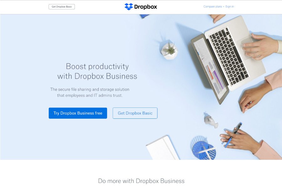
Example: File storage service Dropbox includes a prominent “Try Dropbox Business free” CTA button on their homepage.
7. Include Social Proof
Social proof is a powerful psychological phenomenon. It influences people’s decisions based on the actions or opinions of others. Including social proof on your homepage is essential for building credibility, fostering trust, and ultimately increasing conversion rates for your startup. Here are several reasons why you should include social proof on your homepage:
1. Enhanced Credibility & Trust
Displaying testimonials, case studies, or logos of well-known clients and partners showcases your startup’s track record of success. This validation from satisfied customers or respected organizations enhances your credibility, making potential customers more confident in your product or service. Social proof helps to foster trust between your startup and potential customers. When visitors see that others have had positive experiences with your offering, they are more likely to trust that your product or service will meet their needs as well.
2. Reduced Decision-Making Uncertainty
Potential customers often experience uncertainty when deciding whether to invest in a new product or service. Social proof helps to alleviate this uncertainty by demonstrating that others have already made the same decision and had a positive outcome. This reassurance can encourage visitors to take the next step and engage with your offering.
3. Amplified Perceived Value
Including social proof on your homepage can increase the perceived value of your product or service. When visitors see endorsements from satisfied customers or industry experts, they are more likely to view your offering as valuable and worthy of investment.
4. Higher Conversion Rates
Social proof has been shown to increase conversion rates across various industries. By incorporating social proof elements into your homepage, you can encourage more visitors to take the desired action, whether it’s signing up for a free trial, purchasing a product, or joining a mailing list.
5. Leveraging the Bandwagon Effect
The bandwagon effect is a psychological phenomenon where people are more likely to engage in an activity or adopt an opinion if they believe others are doing the same. Featuring social proof on your homepage capitalizes on the bandwagon effect, encouraging potential customers to follow the lead of others who have already chosen your product or service.
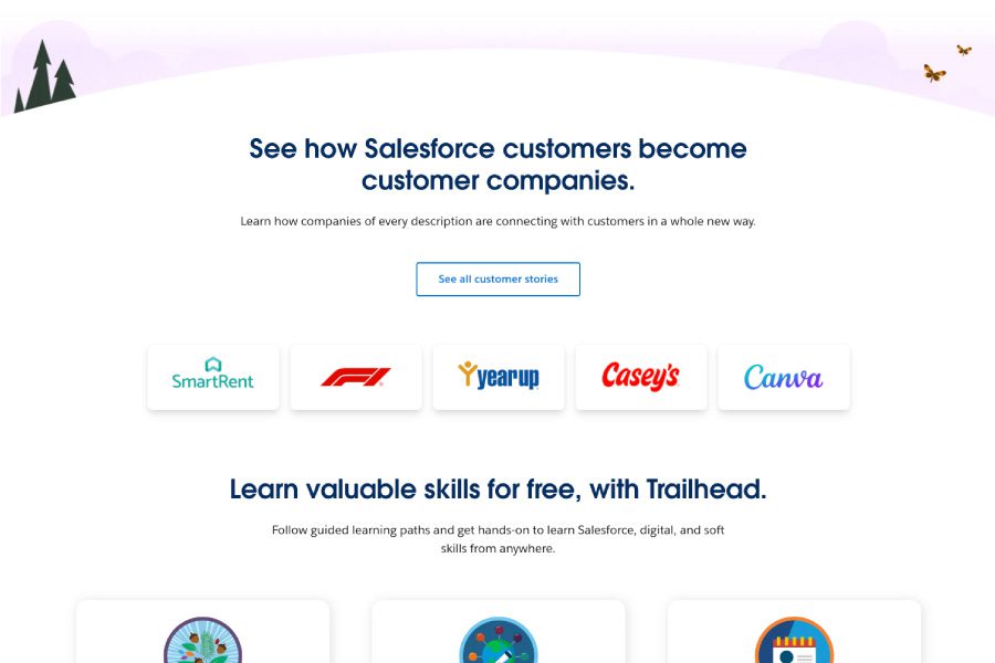
Example: CRM platform Salesforce showcases customer success stories and recognizable logos on their homepage.
Use these homepage best practices & convert visitors into customers!
An effective homepage is essential for startup entrepreneurs so they can capture the interest of potential customers, investors, and partners. By following these web design best practices, you’ll create a homepage that has a clear value proposition, appeals to your target audience, and encourages engagement. Need help? Big Storm can help improve your startup website’s homepage. Don’t wait – contact Big Storm today and watch your startup thrive!

